


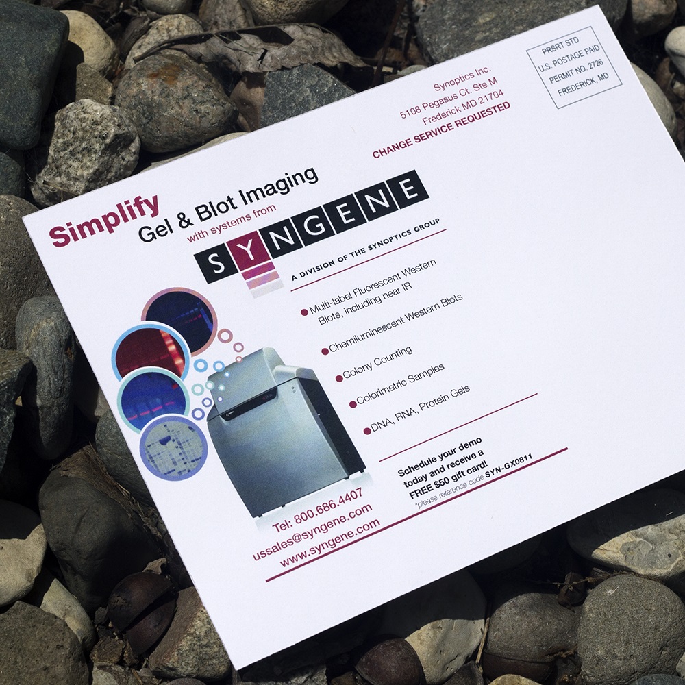

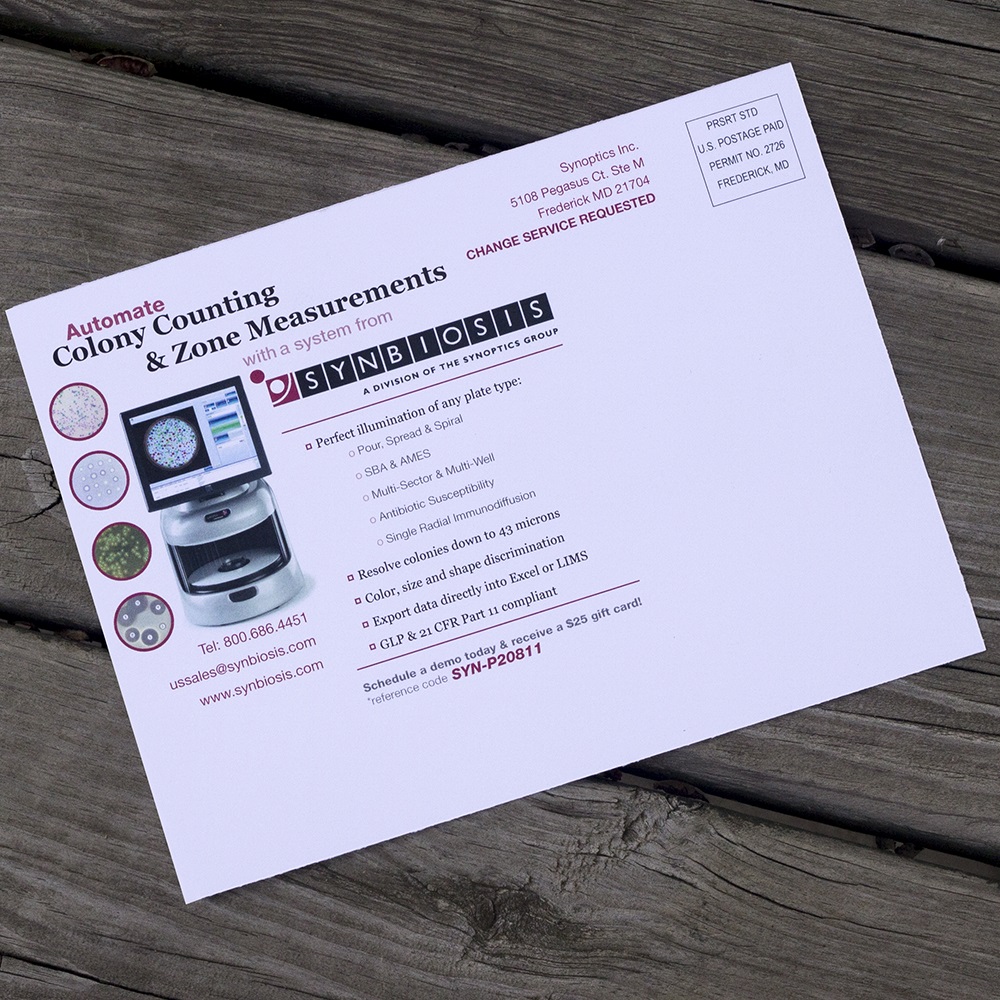

In the summer of 2011, The Synoptics Group sought to advertise products developed by two of their divisions with business-to-business direct-mail postcards. Because the divisions develop products intended for different target audiences, the messaging and imagery would be separate. The product from Syngene served a basic function, and would be targeted at smaller labs who were not necessarily familiar with the Synoptics group. The product from Synbiosis was a more premium one because of its automated features, so it was aimed at larger labs with more potential budget to spare. Being a young designer eager to prove myself, I proposed to them that I would plan, shoot, and edit the photos I would be using, rather than searching for stock images, and they agreed.
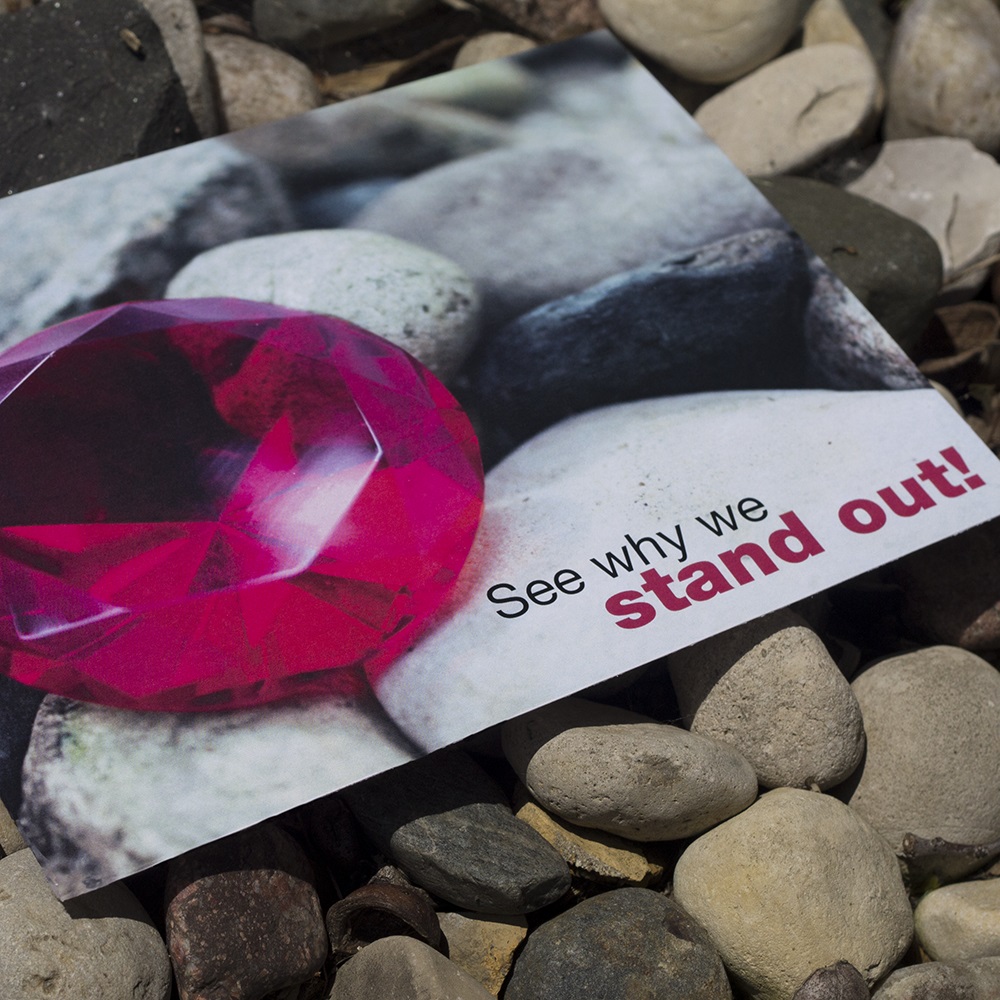
"See why we stand out!" with a jewel among rocks conveys the 'diamond in the rough' or 'needle in a haystack' level of value that being an early adopter of the new, highly advanced product developed by Synbiosis could bring to potential customers. I did a great deal of photo retouching to make the gem appear flawless in the final image. I also edited the jewel's tone to match The Synoptics Group's magenta branding.
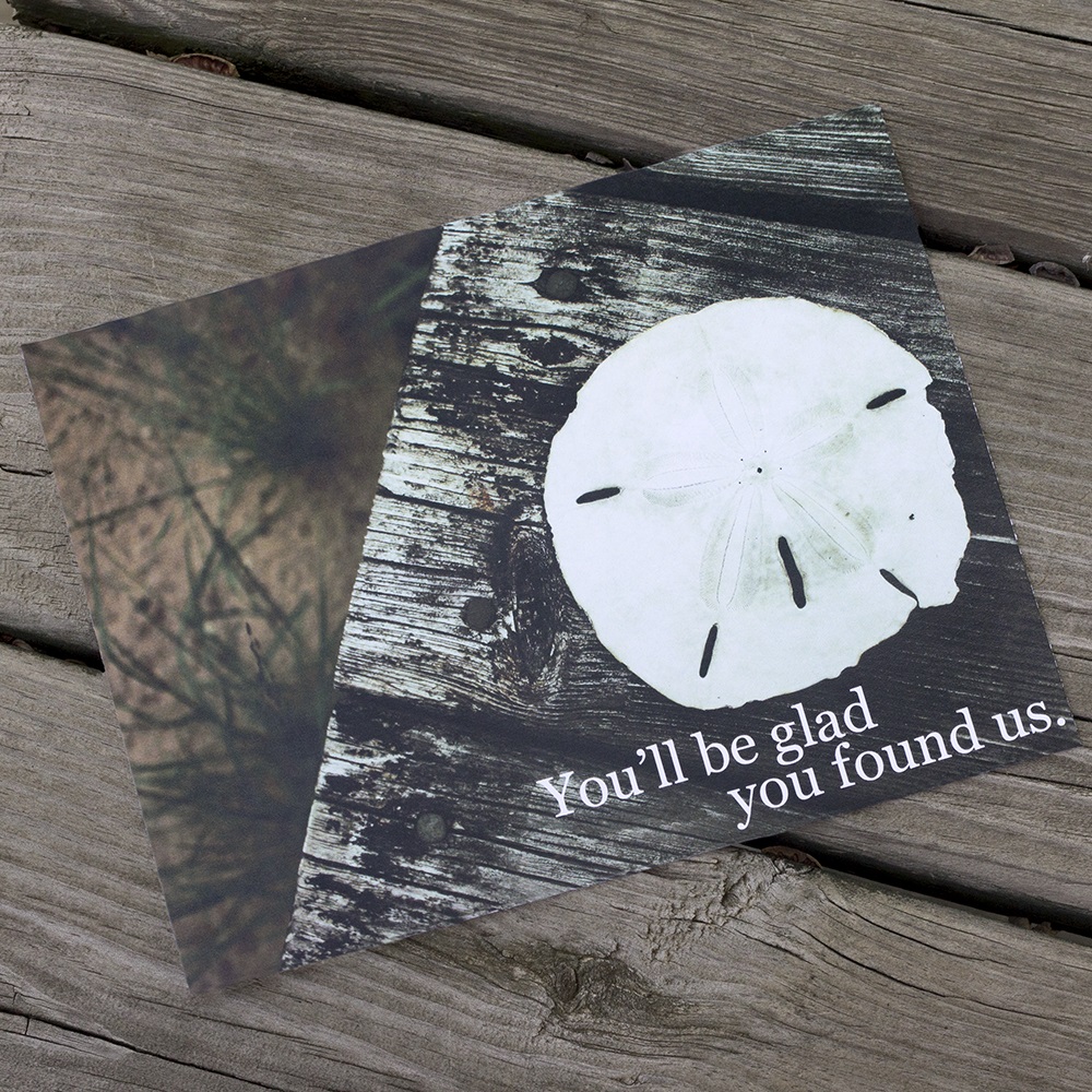
"You'll be glad you found us" paired with with a sand dollar on a dock feels more earthy and simple, but still communicates the value and cost-effectiveness of Syngene's basic products. Much of my photo retouching involved making the delicate star pattern on the sand dollar more visible, while still keeping the focus of the photo well-lit.
As for the informational sides of both postcards, this was my first time creating something for direct-mail, but it was no problem for me to find a basic USPS template online delineating the safe areas I needed to leave blank for postal markings. During one round of changes, the client brought me a rough sketch and asked me to create the 'thought bubble' arrangement of the product & sample images on the Syngene card. Even if the cards were intended for separate audiences, the client didn't want the product lockups to both be the same exact layout.
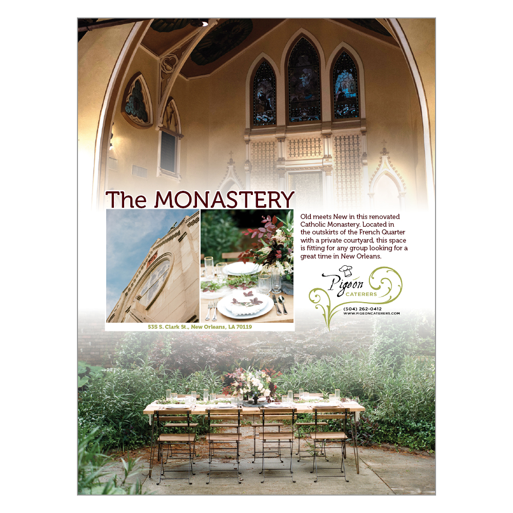
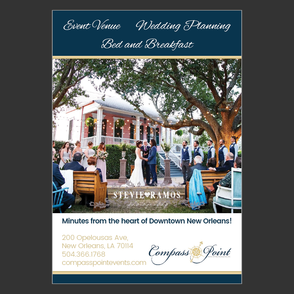

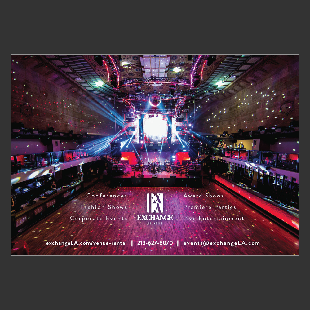
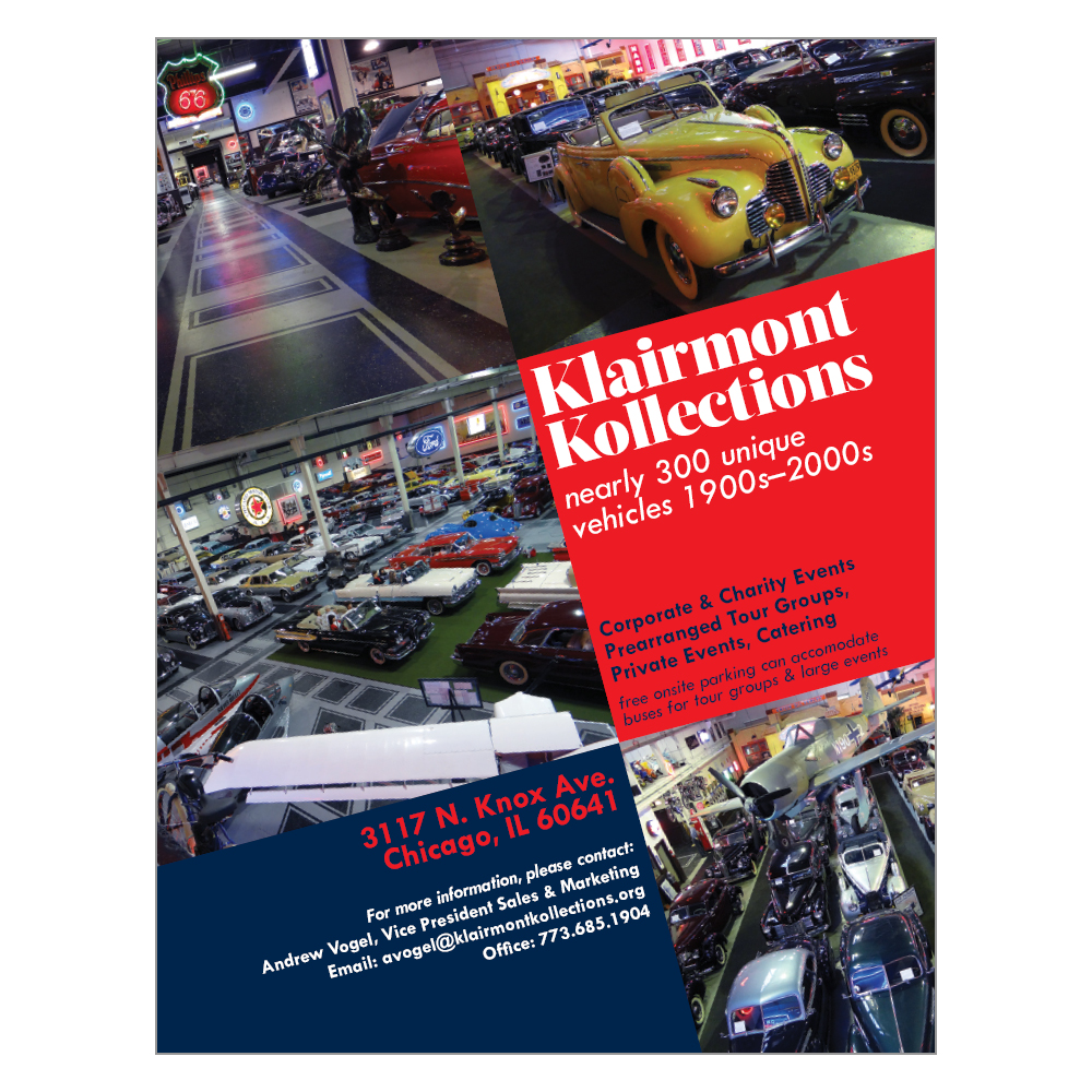
Magazine-style travel guides are a major focus of the work at Miles Partnership and display ads like these are scattered throughout the pages. All of these ads are for clients that provided some images, copy, and sometimes some direction (but sometimes no direction at all until after the first draft) and I was tasked with creating a display ad to fit within the ad dimensions they paid for.
The first three ads I had no direction other than a few images and sometimes a logo and official colors. These three are the results of trying out new things based on the feel of the individual businesses. Exchange LA included in their materials an airy, primarily photo-based ad from a hotel as an example for the feel they wanted, and I did my best to replicate it. Klairmont Kollections provided a wealth of images, not all of which could be included, so I showed them several different layout options before they settled on this.

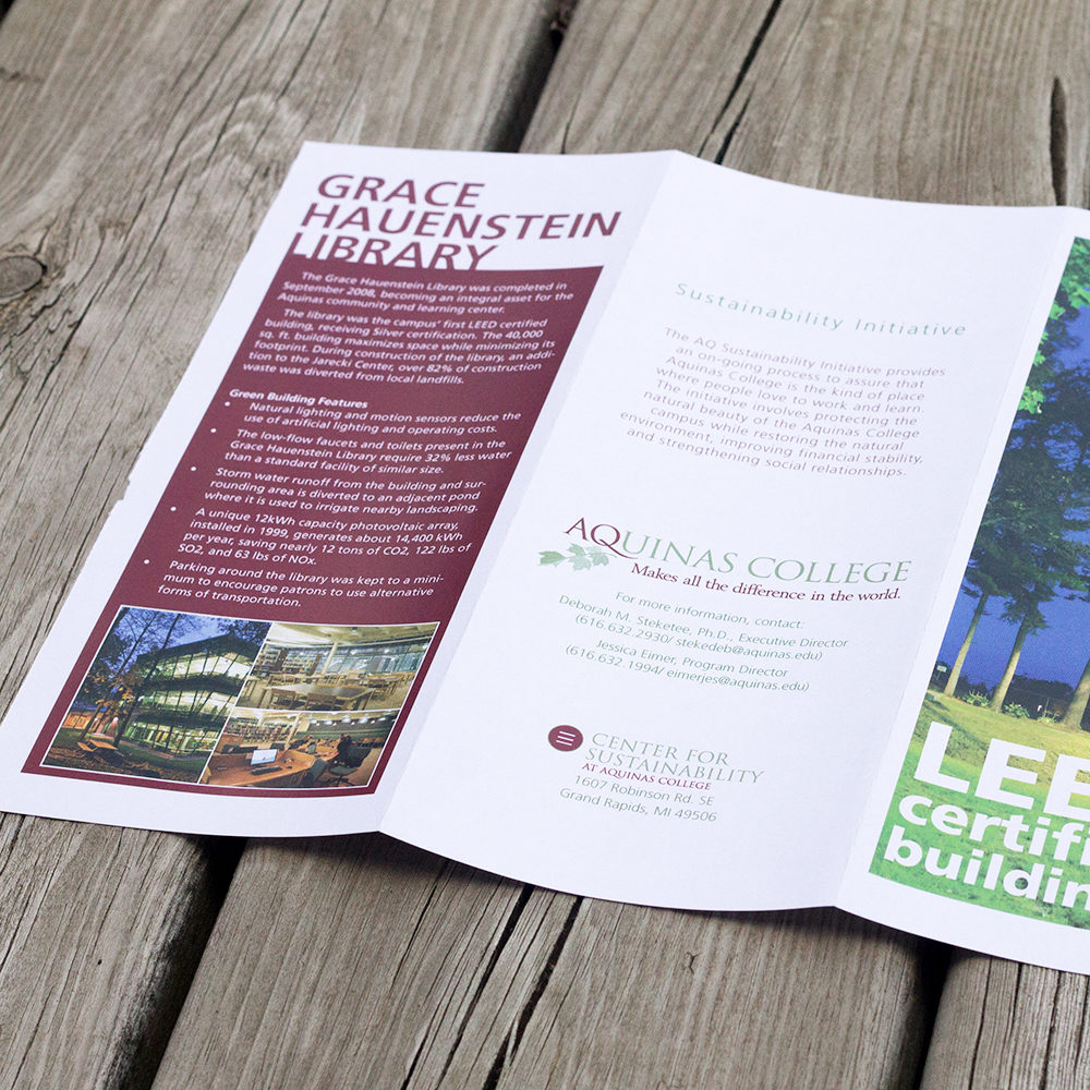
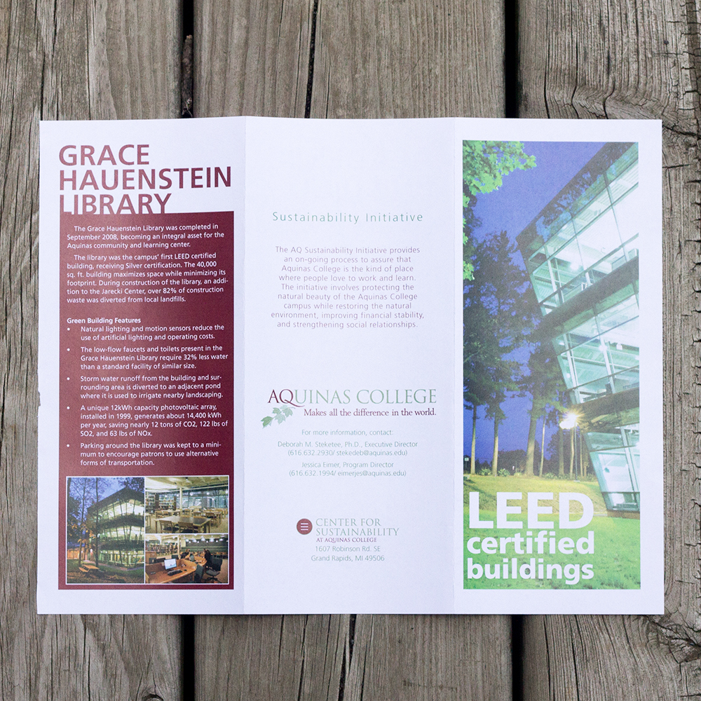
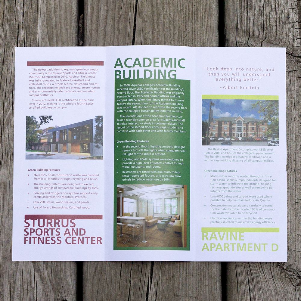
An official informational brochure about the buildings on the Aquinas College campus that are LEED certified, and exactly what makes them that way. I sifted through the college's official photo collection to find good photos of each building and created the brochure from scratch, abiding the college's brand standards. The design was specifically made to be able to printed in the Graphic Services center on campus, rather than needing to be printed with bleed off-site somewhere each time more are needed.
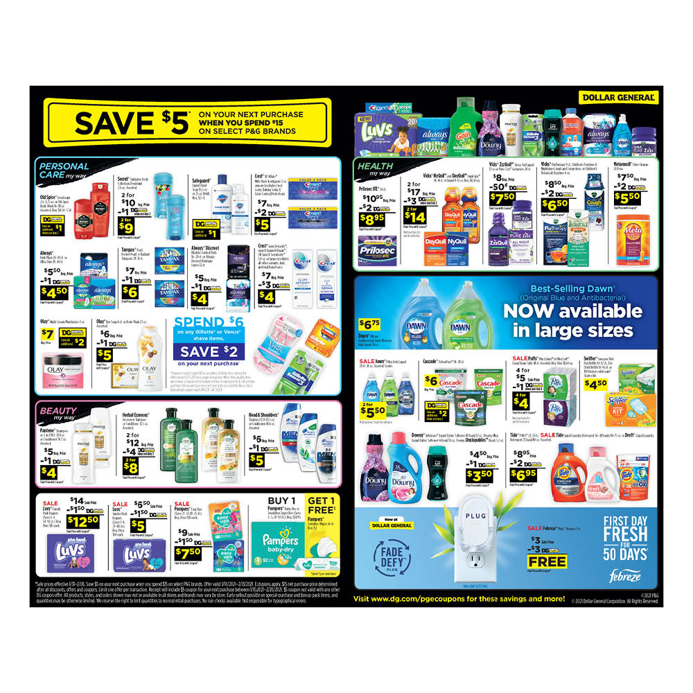
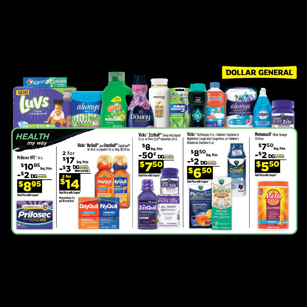
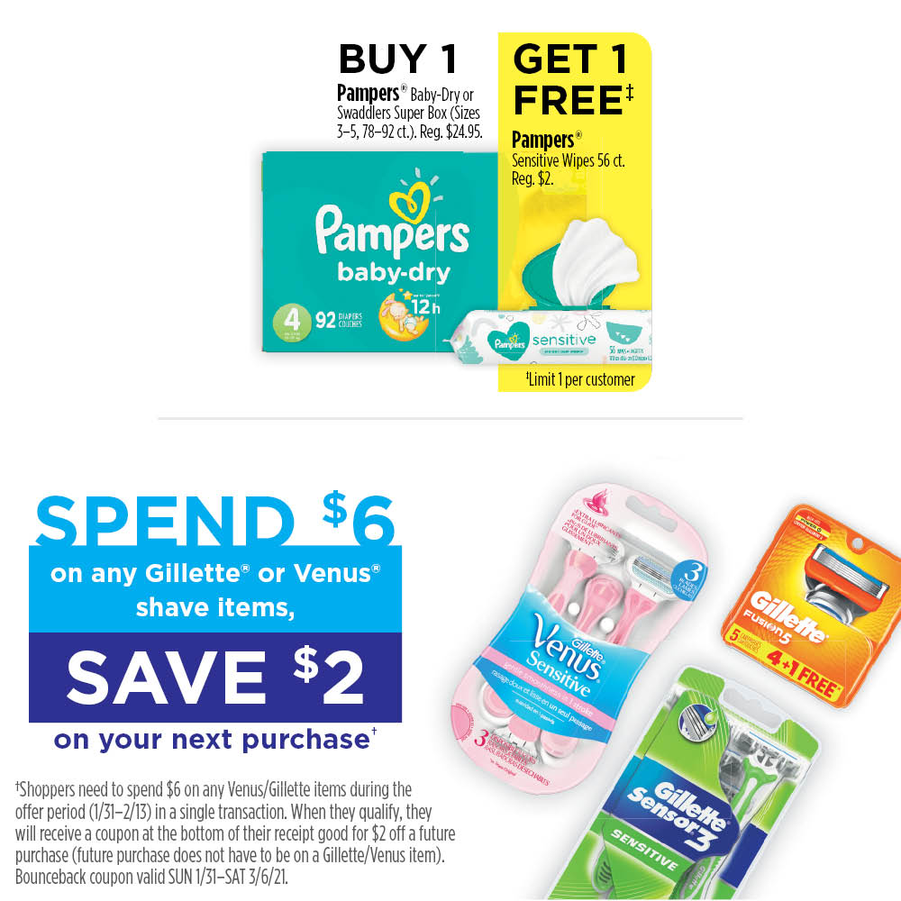
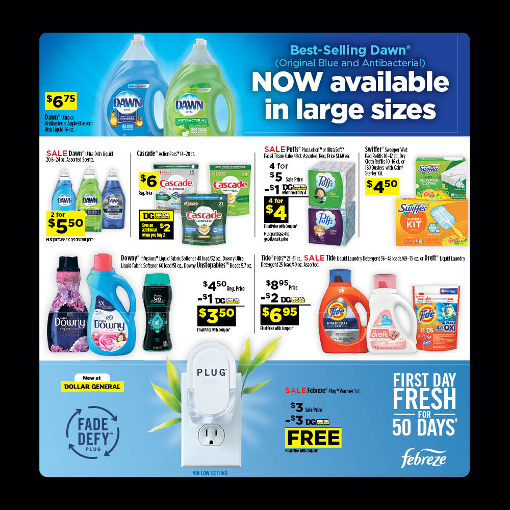
Every few months, Procter & Gamble would run a center spread in the Dollar General circular ad, in order to advertise deals and coupons.
As the retained designer for the P&G/Dollar General customer marketing team at The Integer Group, I created and fine-tuned the layouts for these ads many times during my four years working there. The client sent our business manager a spreadsheet with all the groupings of products, details (such as size, varieties, and exclusions), net-down math, and the product images we should use for each ad block. Over the ensuing monthlong cycle of design and feedback, many of the products and deals would shift significantly, so I had to design flexibly from the start. Sometimes the client wanted certain products’ ad blocks to be more creative than the normal designs, but we didn’t have capacity to pull in an art director, so I took the reins instead (see slides 3 & 4). There was no written style guide for this periodic circular, so after amassing small personal library of the commonly used assets, I eventually set up a formal template and small set of instructions for my successors to use.
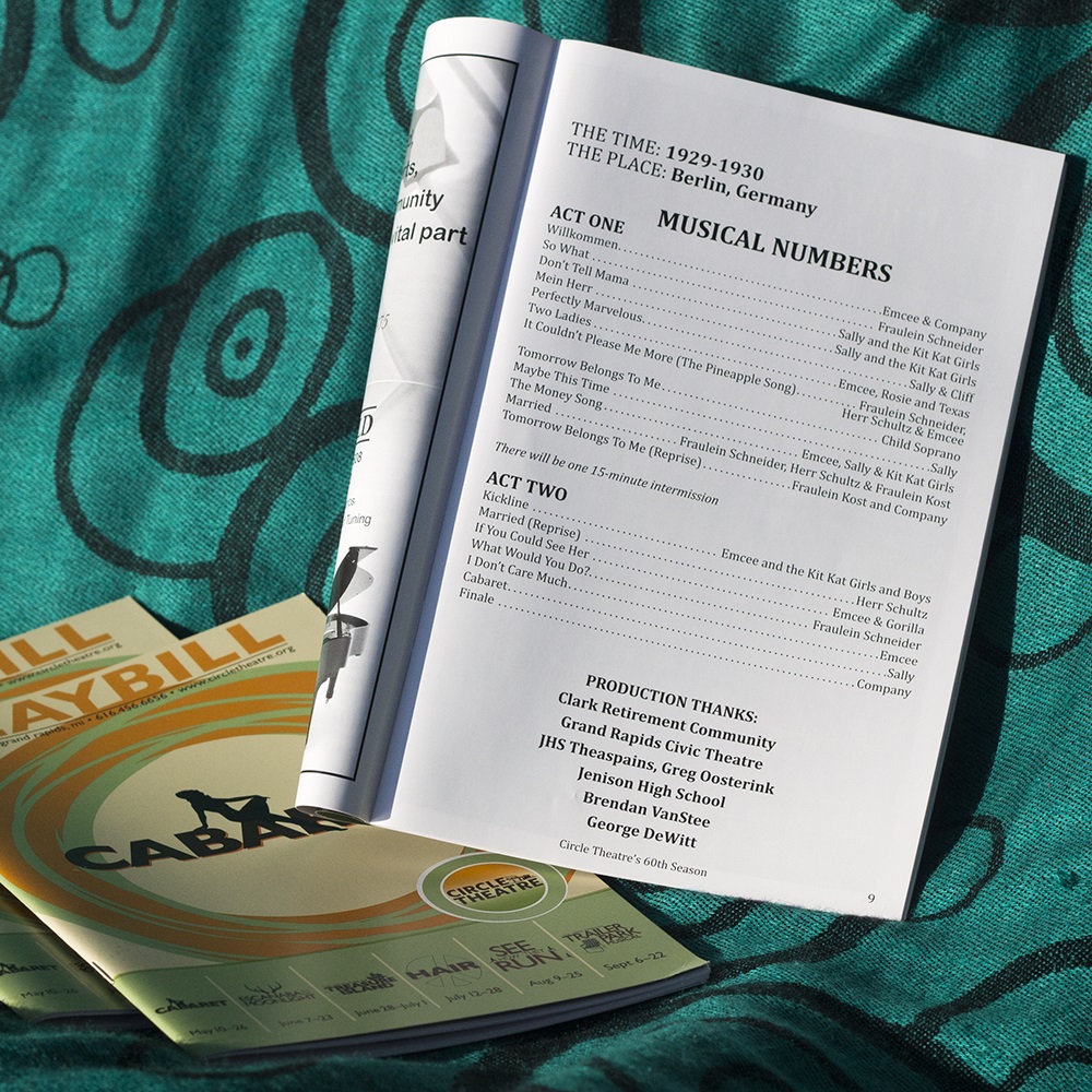
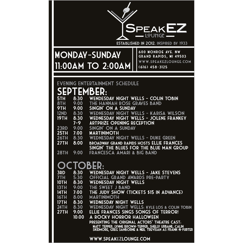
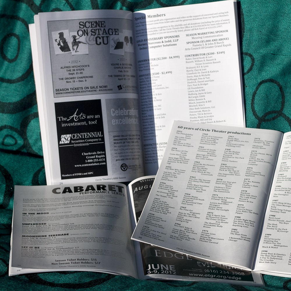
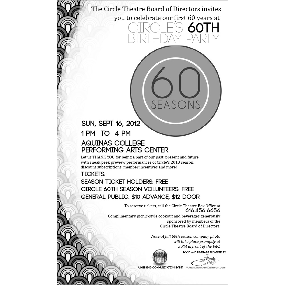
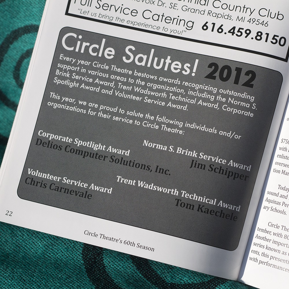
Circle Theatre is a small, award-winning theater in Grand Rapids, Michigan. They tasked me with laying out 50+ page playbills for each of their shows during their 2012 season. I organized donor lists, ad layouts, and cast bios and all sorts of other information, as well as created advertisement blocks for some small businesses (SpeakEZ Lounge).
Site design © Marah Klose, 2017-2025. Do not reproduce site or works without express written consent.