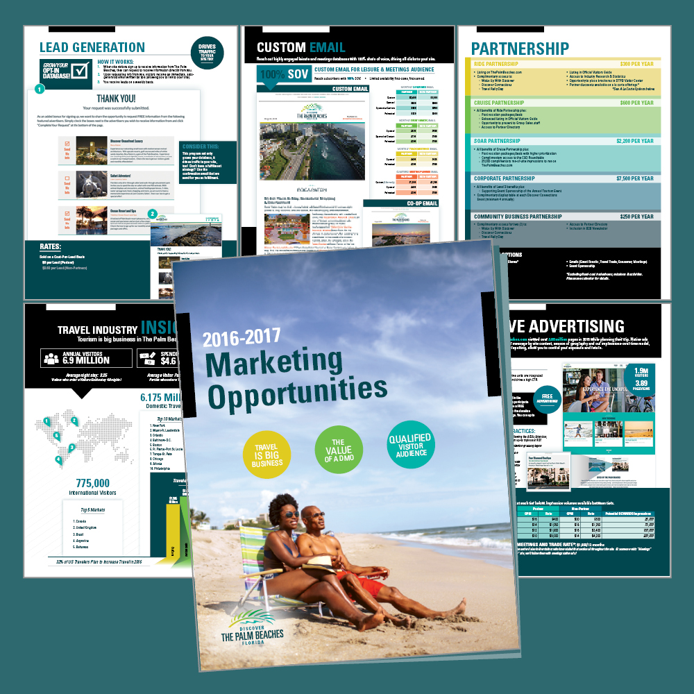
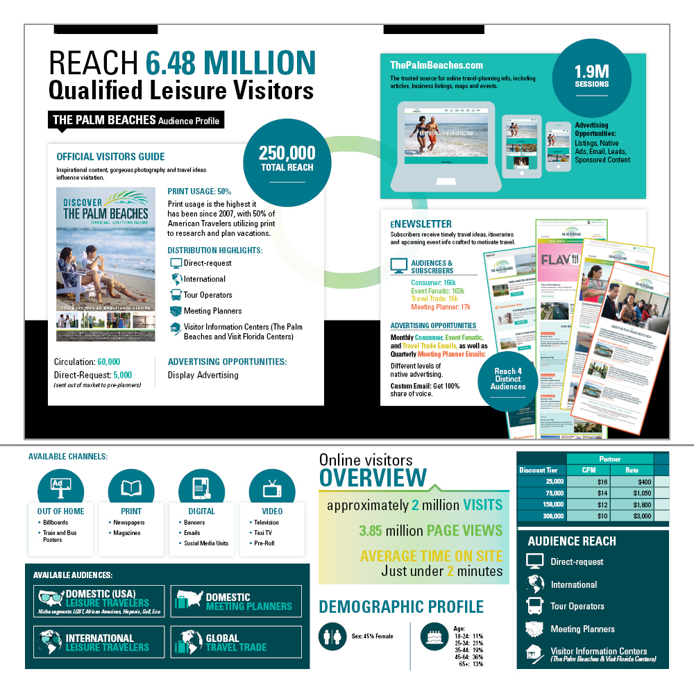
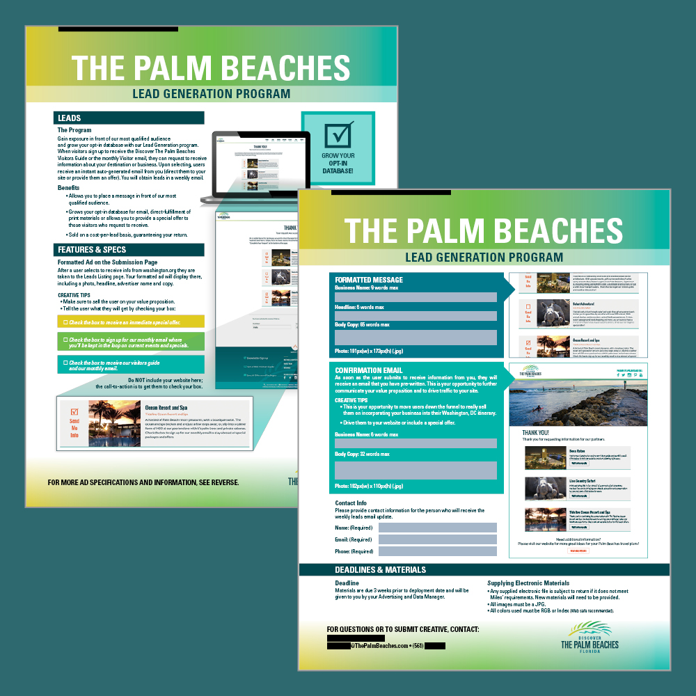

Discover The Palm Beaches, the official tourism marketing corporation for Palm Beach County recently rebranded their website and wanted new materials to market advertising opportunities to local businesses.
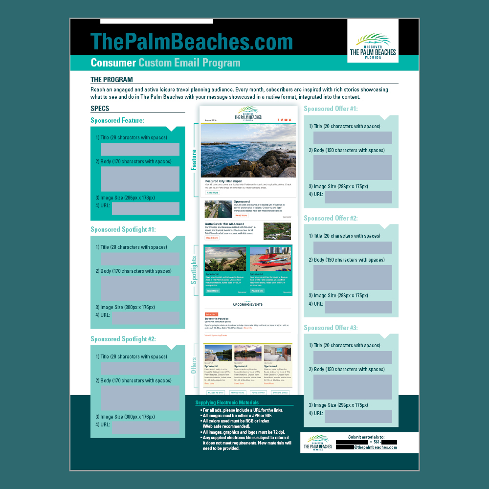
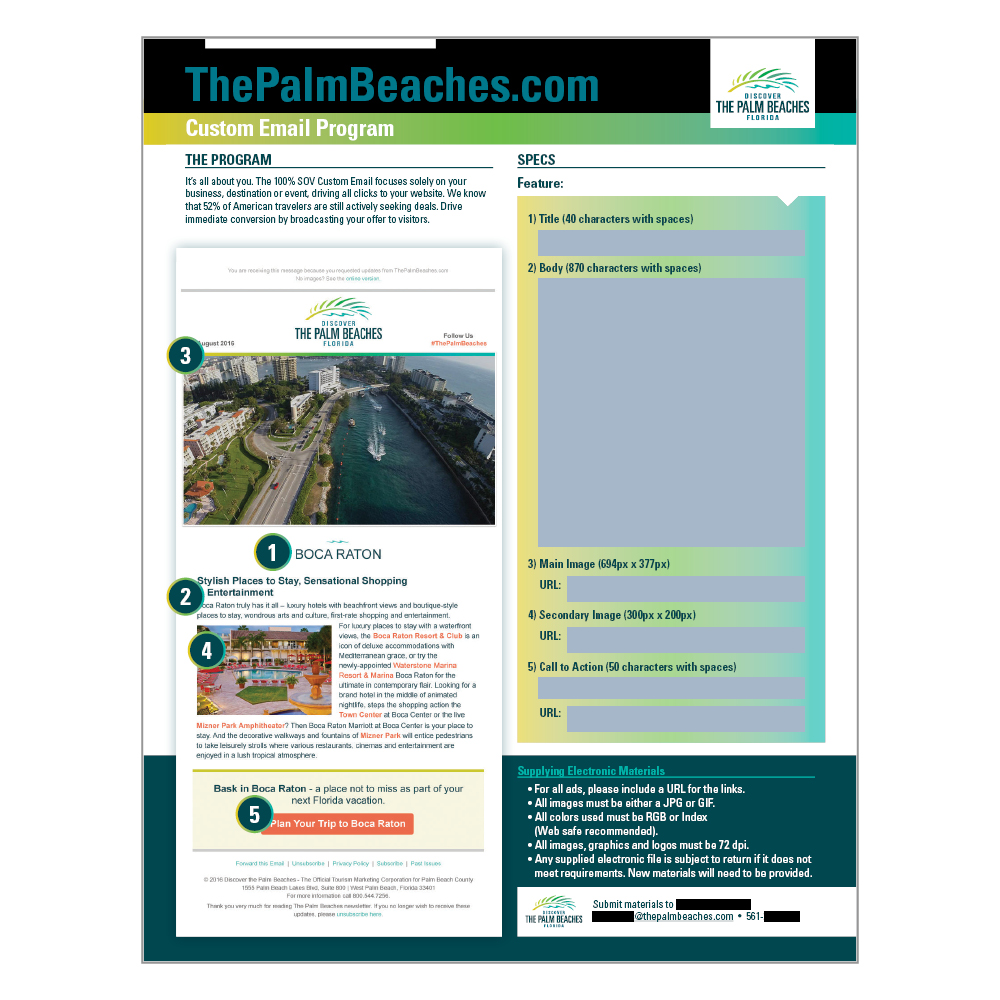
I began with the brand standards guide for DTPB and elements of a very rough template Miles Partnership uses as the starting point for other Rate Card documents. As the primary designer for all the new business-to-business marketing materials, I combined all the ideas into a meticulously organized set of documents with a cohesive look. I completed the 16-page Rate Card (see slides 1 & 2) and a variety of individual forms for different advertising submissions (see slides 3-5). I prepared each of the forms in Adobe Acrobat to be filled out digitally, complete with character limits where needed.
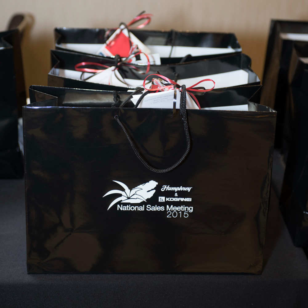
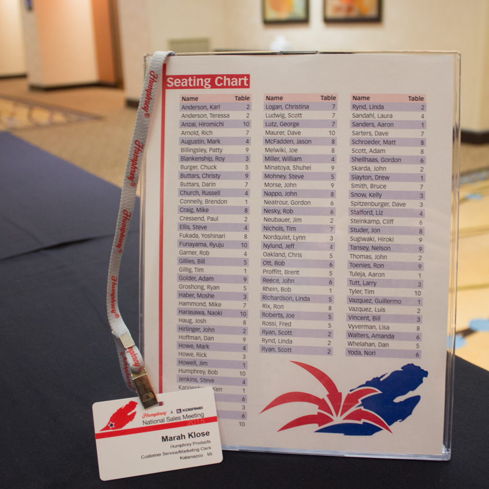
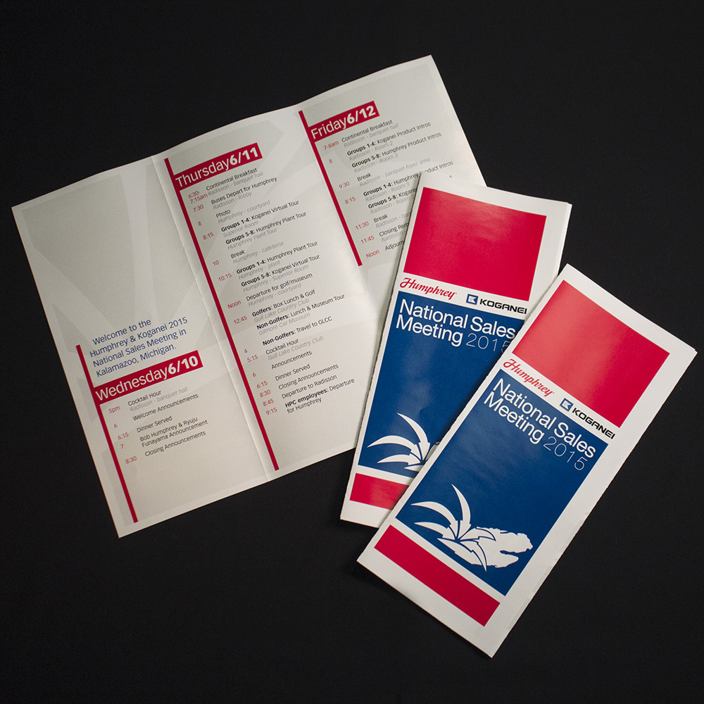
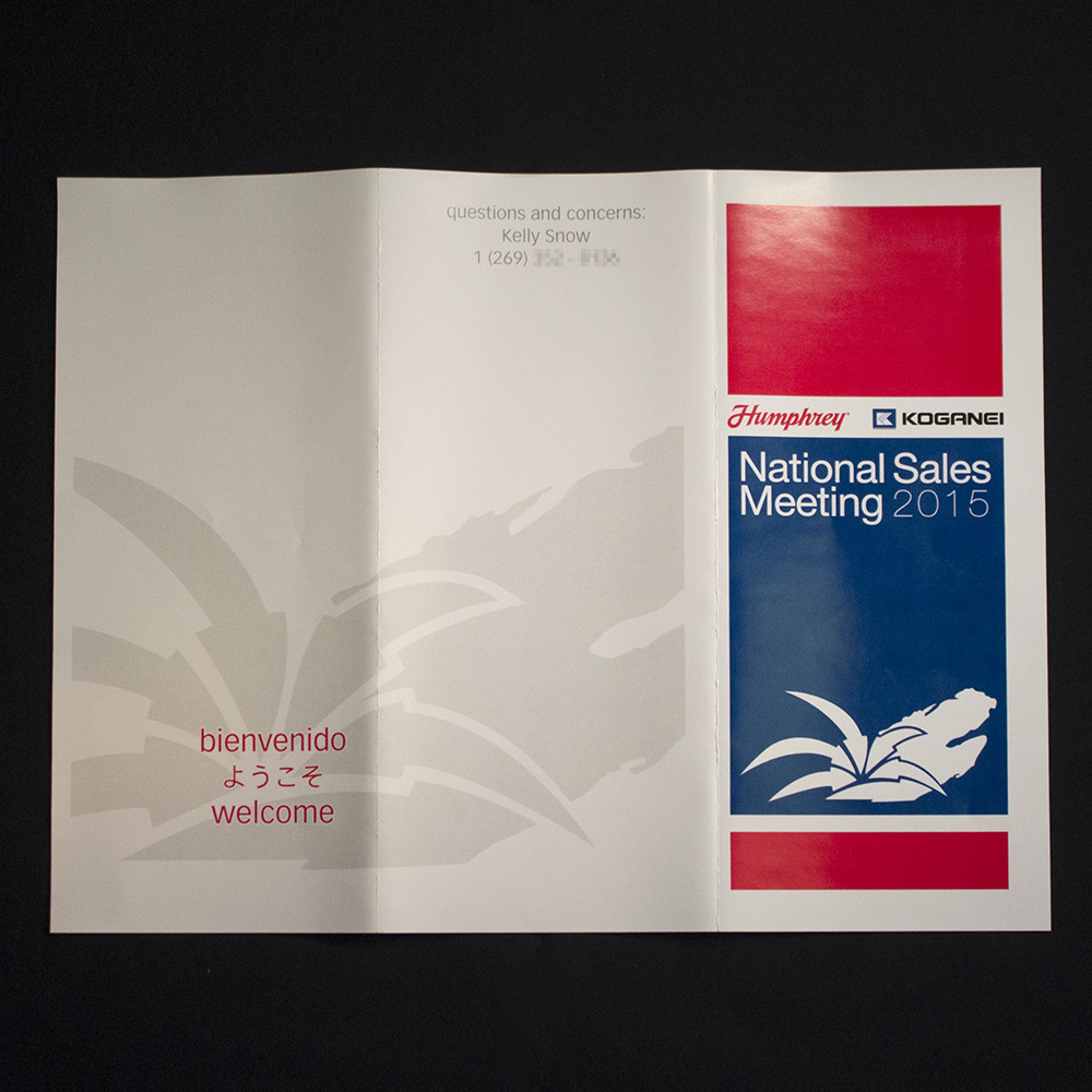
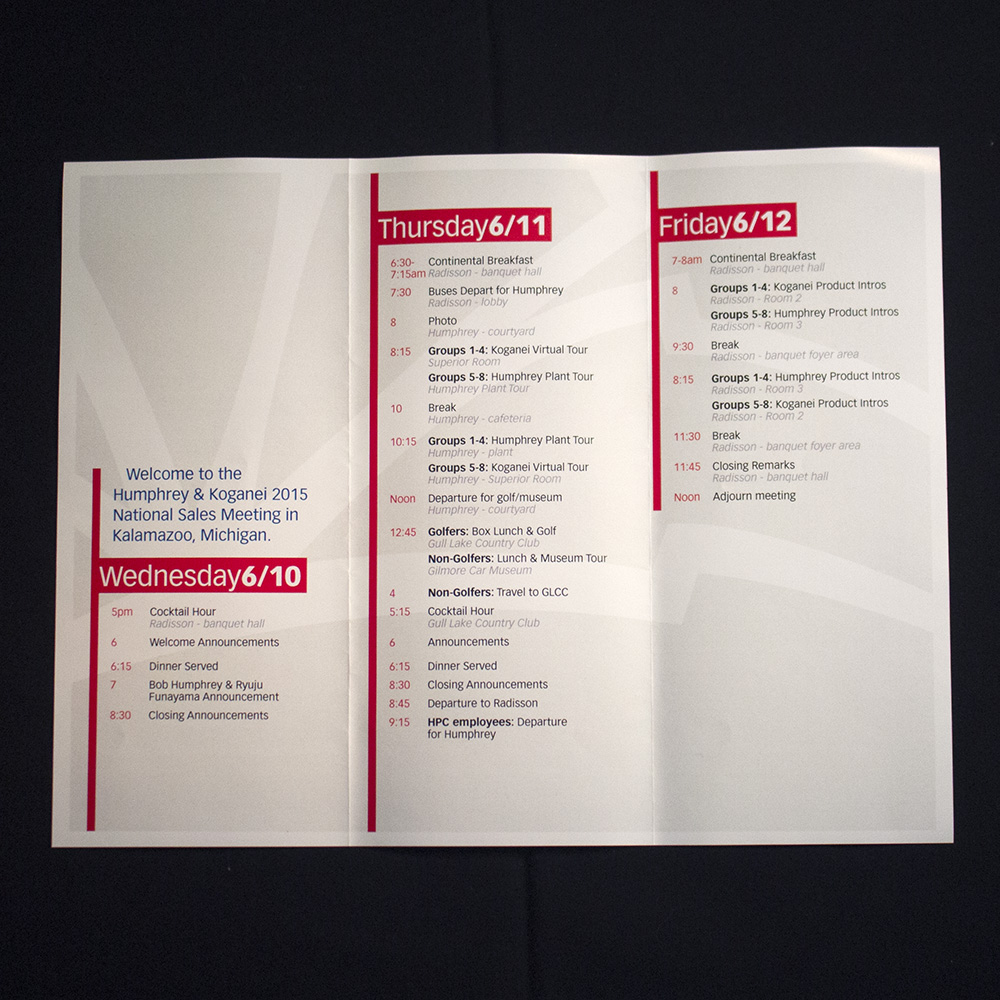

Humphrey Products Company and Koganei Coproration have been partners for decades. In June of 2015 they hosted a joint, multi-day meeting to share new products and announcements with representatives of their North American distributors. I created an event logo to be used on multiple items, particularly the tri-fold schedule participants consulted all three days.
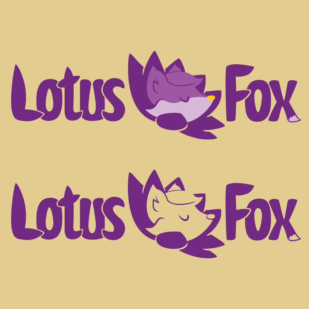
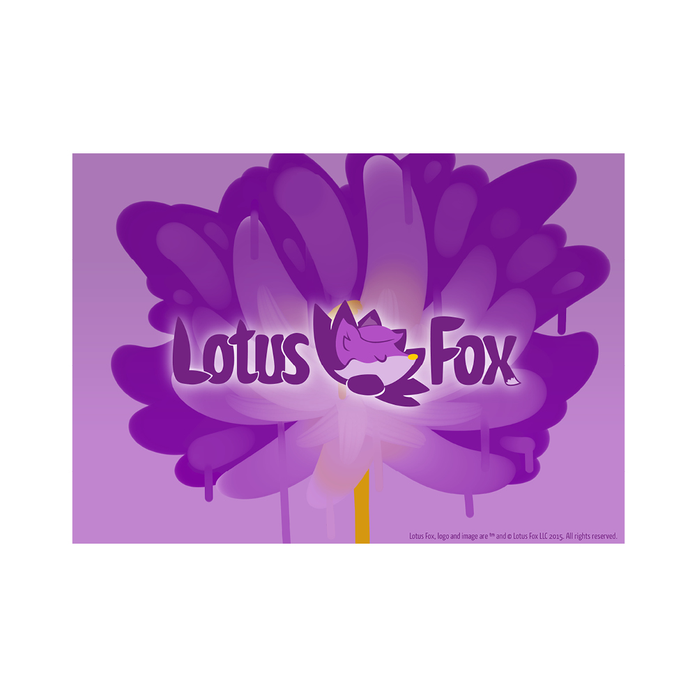
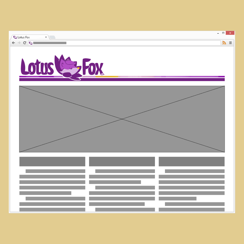
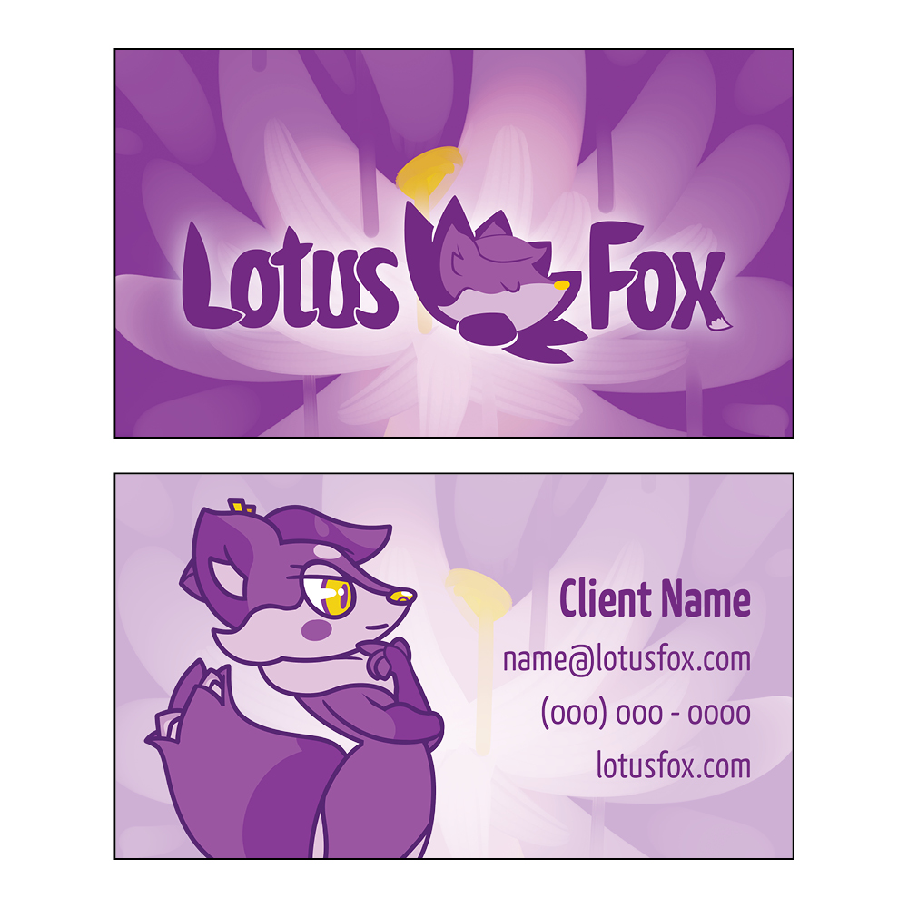
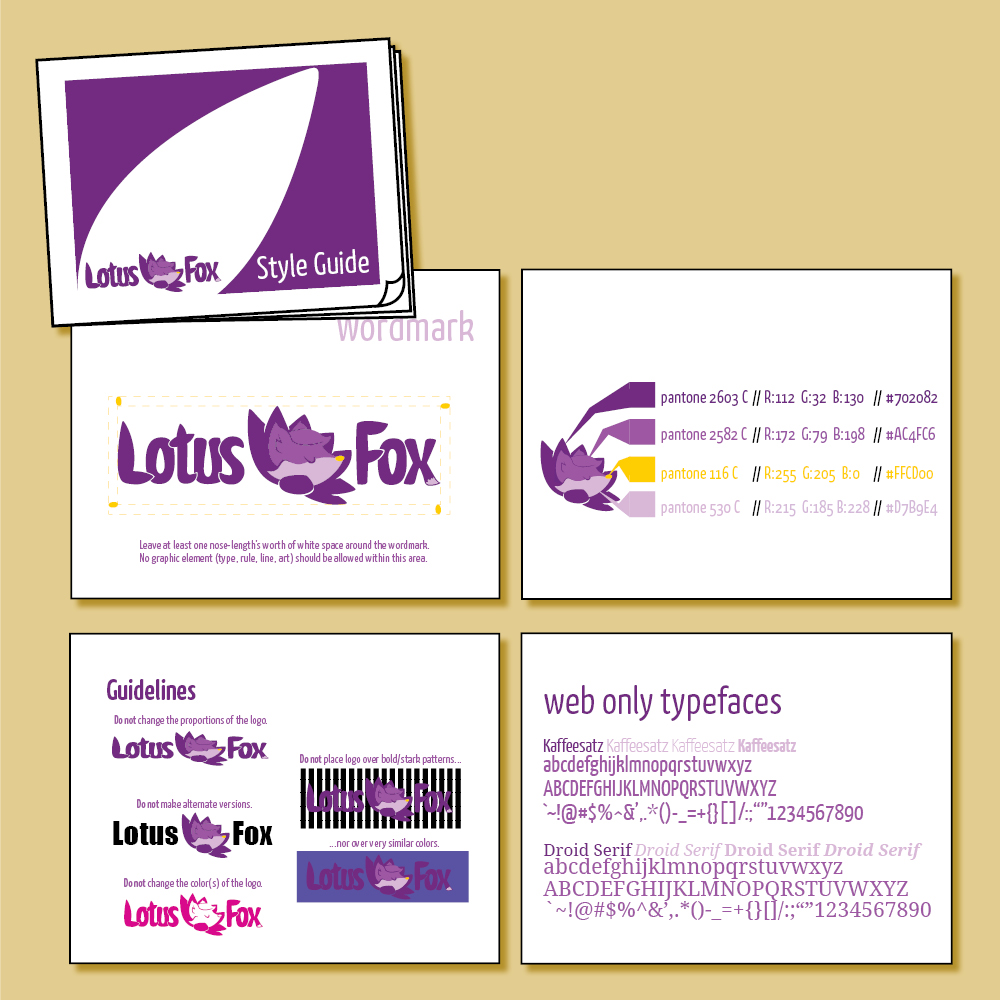

A new company called Lotus Fox Studios needed brand identity materials and its founder contacted an illustrator friend of mine and me. The company is working on producing creative tools, education aids, and games. The itemized production list on our final contract included a mascot design, alternate pose mascot mascot illustrations, Full Color and One Color variations of the logo & wordmark, a business card design, a web header, a vanity plate, and a brand standards reference document.
My co-designer planned and illustrated the mascot based on suggestions from the client, and I took their design elements and adapted it into the final vector logo. For the brand standards document, I defined the official colors in RGB, Hex, and Pantone and included my approved recommendations for print and web fonts, as well as guidelines for permissible use of the logo in future designs. I used my co-designer's illustrations as background & graphical elements for the vanity plate and business card.

In my various design positions at Aquinas College, I designed different logos for a variety of initiatives and groups. I consistently used the primary official maroon Pantone color of the college, often used its secondary sage green, and once in these examples I use a tertiary gold color.
The Edward C. Balog Research Foundation is a student-run student research fund.
The Sport Management Club logo incorporates imagery from multiple intercollegiate sport teams on campus such as lacrosse, soccer, and track & field.
Student Dollars in Action logo is used on event ads to denote Student Senate-funded events. The Students in Action Awards is an honors assembly for underclassmen. Student Affairs is a combination of departments and wanted to consistently mark their major events throughout the year, such as Sophomore Pinning (where sophomores declare their majors).
"I am a Saint" ties into a school spirit-building initiatives, primarily around Homecoming in the fall.
The Student Senate and the Registered Student Organization Assembly are branches of student government that formed after a restructuring in spring of 2012.
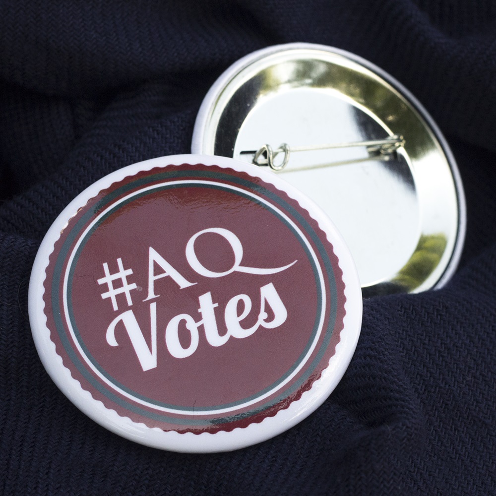
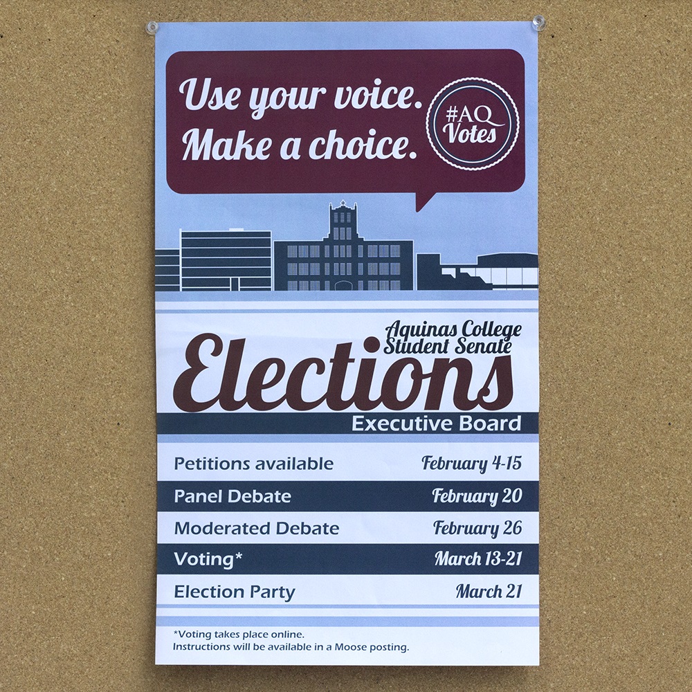
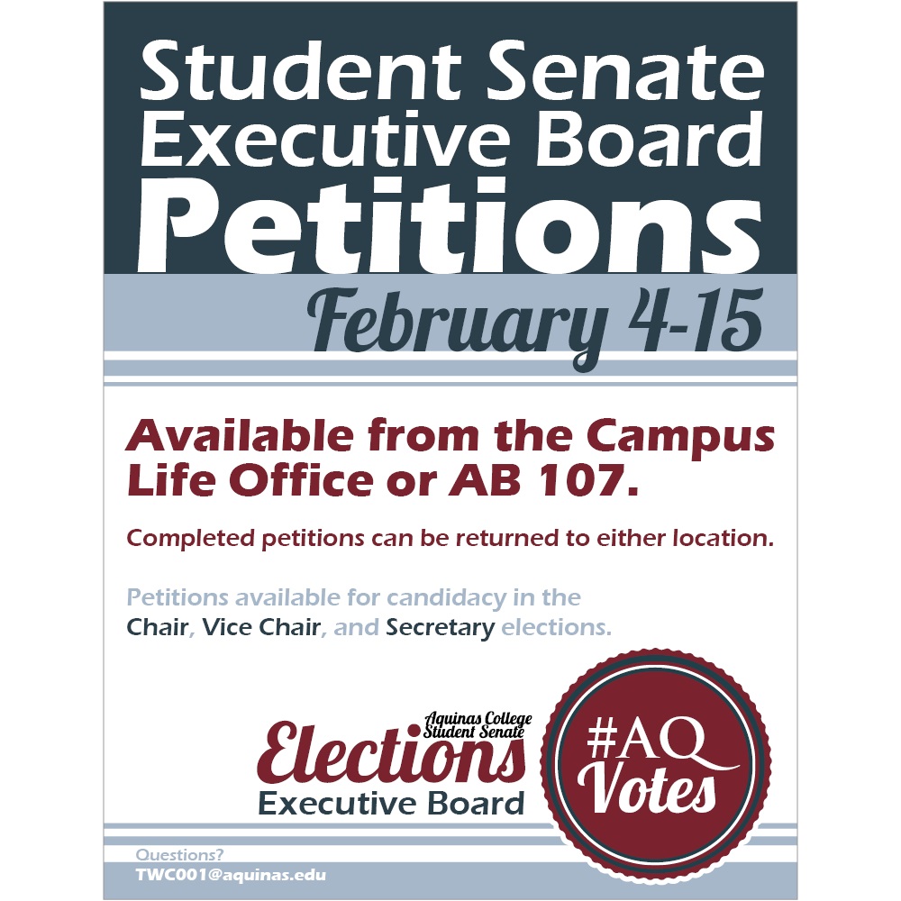
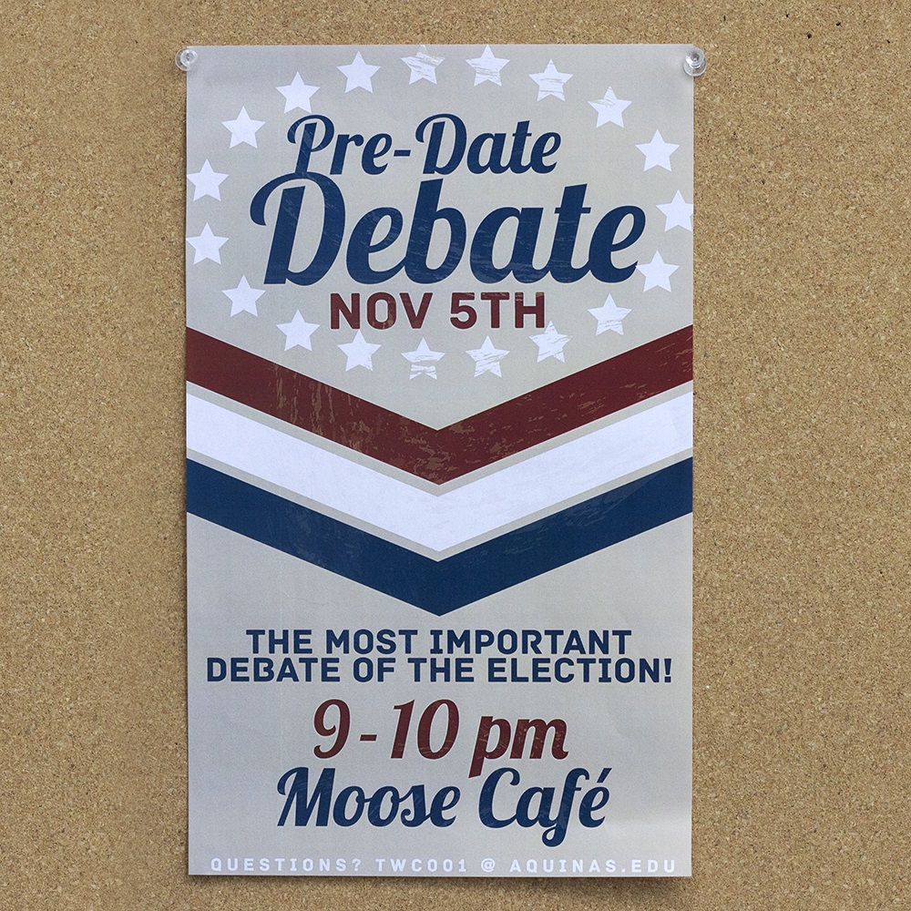
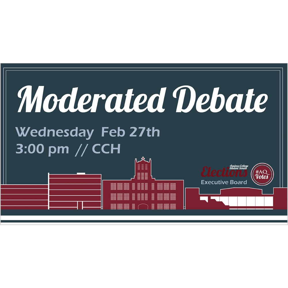
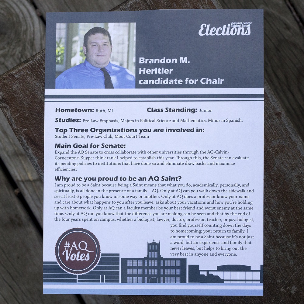

In 2012, the Student Senate board elections coincided roughly with the US General Election. In the interests of encouraging civic engagement on the national scale, as well as interest in student government, the Student Senate and Campus Life offices asked me to create a button that felt like an "I Voted" sticker.
In addition to the button, my clients desired a cohesive, identifying style for the ads and other print collateral related to the Student Senate elections, so students would notice all the events and understand more quickly that they are related. I used a specific subset of the college's official Pantone colors (the primary maroon, and two blues included in the tertiary colors) to unify the designs, as well as repeating the same typefaces across all designs, particularly making use of the Eras font family's different weights and similar feel to "Lobster," the script font used in most of these pieces. I also created a matching set of line illustrations of the college's three classroom buildings: a science building, a main academic building, and a fine arts center.
Materials for this overall campaign ranged in size from the 2” button, to a wide-format digital ad displayed on various TV screens around campus, to multiple foam-board-mounted profiles displayed on easels, to a 72” vertical banner hung in the tall, stairway entrance to the dining hall.
Site design © Marah Klose, 2017-2025. Do not reproduce site or works without express written consent.